Using Layouts Management
Layouts
are used to design and arrange the content
(text, images, and .swf files) where you want them to appear in the presentation.
Each zone in the presentation was created in the template and will need
its own layout only if dynamic text and
possible images are being used. Dynamic text can be edited within the
software. If the zone is being populated with just an image or a playlist,
a layout will not be needed.
Layout
Strategies and Guidelines
■ Write
down the pixel dimensions of the template zones needing a layout. When
you create the layout, it needs to be the same dimensions (set in Layout
Properties) or smaller than the template zone. If it is one pixel too
large, it will not appear in the list of layouts to select when assembling
the presentation.
■ Gain
an understanding of the Z-Index in the
Item Detail Properties. The Z-Index helps you layer images and text in
the proper order. See Setting
Item Detail Properties.
■ If
your Layout Item Details are too short
for the intended text, the text will wrap. Be sure to create a layout
item detail that will fit the text appropriately.
■ Use
our recommended naming conventions for clarity and ease of searching in
the future. See Layout
Naming Conventions.
See Layout
Strategies and Guidelines
See Accessing
the Layouts
See Creating
a New Layout
See Setting
Layout Properties
See Setting
Item Detail Properties
See
Understanding
the Z-Index
See Setting Item Types
See Using
Layout Groups
See Five
Main Steps for Creating Layout Groups
See Applying
Themes to the Layout
See Removing
Applied Themes
See Saving
the Layout
See Using
the Layout
See Editing
an Existing Layout
See Saving
a Layout as a Different File Name
See Deleting
a Layout
See Copying
a Layout


Accessing
the Layouts
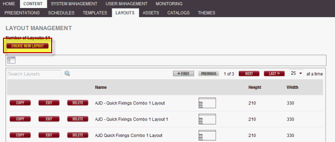
In the Layouts tab, you
can create your own custom layouts for presentations. Click the Content/Layouts
tab to see the following window, which lists any layouts already created
(if applicable).
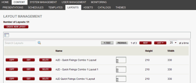
In this window, you can
do the following:
■ Click
Create New Layout to create a new layout.
■ Click
Copy to copy the layout.
■ Click
Edit to edit the layout.
■ Click
Delete to permanently delete the layout.
■ Search
for a layout by entering the file name or the first few characters in
the Search field.
■ Click
any column head to sort the layouts in ascending or descending order by
the information in the column. An up or down arrow appears.
For Example: To sort in ascending
order by layout name, click the Name column head. An up arrow appears
next to the column head. If you click the column head again, a down arrow
appears and the layouts are sorted in descending order by name.
Go
to Top of Page
Using
Folder Navigator
Each tab under the Content
tab displays a Folder Navigator icon  providing
the opportunity to access the folders you have created in your RoninCast
system. See Using Folder Management
for information on creating new folders.
providing
the opportunity to access the folders you have created in your RoninCast
system. See Using Folder Management
for information on creating new folders.
To use the Folder Navigator:
1. Click the Folder Navigator icon . The
Root of the folders displays.

2. Click
the arrow to expand the Root.
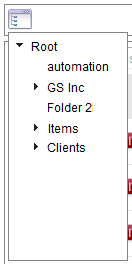
3. Select
a folder. A drop-down list appears next to the Root
drop-down box.
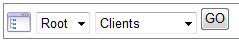
4. Click
GO to open the list or to present
another sub-folder drop-down list.
Creating a New Layout
Creating a layout has five major steps
that need to be completed
before a board can be assembled using the layout.
Set
the Width and Height of the perimeter of the layout according to the
width and height of the template zone for which this layout is being
created. See Setting
Layout Properties.
Add
the layout item details (the blue boxes or zones) and size and layer
(Z-Index) according to board mock-up. See Setting
Item Detail Properties.
Assign
Item Types to each layout item detail. See Setting
Item Types.
Create
layout groups according to how the Item Types were set, if needed
(Some simple layouts can just use the Default Group. See Using
Layout Groups for more details). See Using
Layout Groups. Assign layout
groups to each layout item detail. See Using
Layout Groups.
Apply
themes to layout item details that will contain text. See Applying
Themes to the Layout.
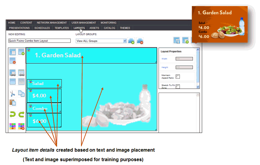
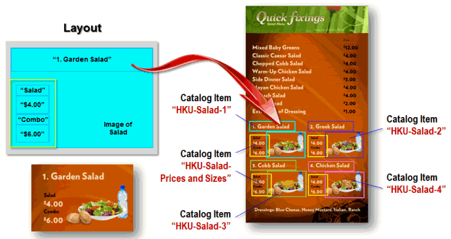
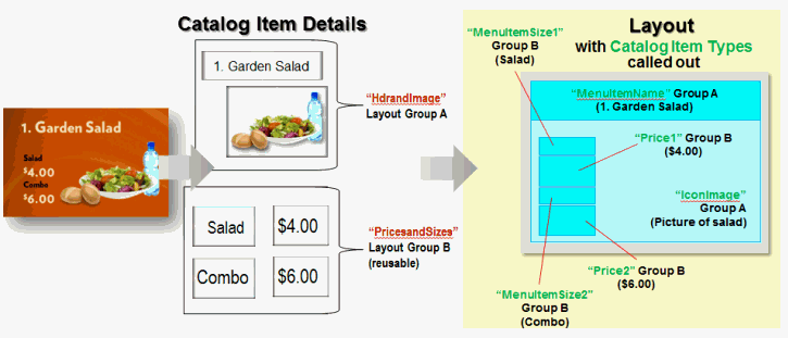
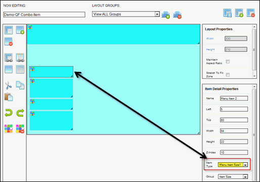
When creating a layout,
you will create an item detail for each item that you want on the menu.
An item detail can be the background image, item name, item size, item
price, etc.
The layout below has six
item details including the background
image as indicated by each blue box. You can determine the placement and
size of each item detail, as well as the text formatting or Theme.
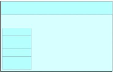
Every layout starts with the dimensions of its perimeter.
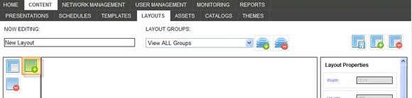
To create a new layout:
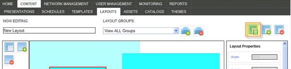
1. Click the Content/Layouts tab.
2. Click Create New Layout.
The following window appears:
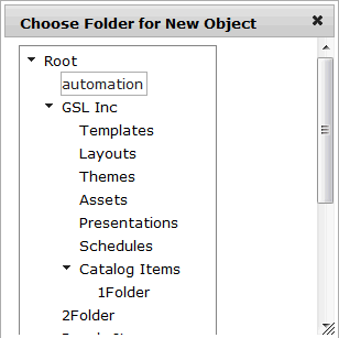
3. In the Choose Folder
for New Object window, select
a folder in which to place the new layout. The following window appears:
NOTE: For more information about Folder Management
and creating new folders, go to Using
Folder Management.
IMPORTANT:
If a folder is not present under the Root, a folder will need to be created
under Folder Management before an object can be created.
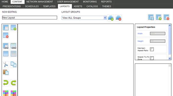
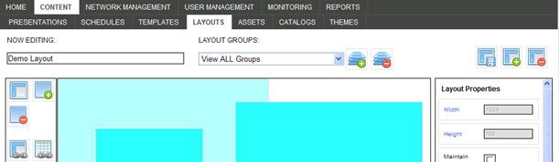
4. In the
Now Editing field, enter a name for the layout using the Naming Convention Best Practices.
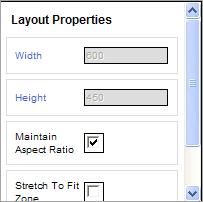
5. Set
the Width and Height
in the Layout Properties:
Width:
Set the width the same dimensions as the width of the zone
in the template in which the layout will be used. Click
the “Width” link to activate this field.
Height: Set the height the same
dimensions as the height of the zone
in the template in which the layout will be used. Click
the “Height” link to activate this field.
Maintain Aspect Ratio: If you select
this field, the ratio of the width and height will be maintained
if you change one of the numbers. For example, if you change the
width, the height will be changed automatically to maintain the
ratio.
TIP: It is not recommended to
select Maintain Aspect Ratio
when creating custom layouts.
Stretch to Fit Zone: LEAVE THIS
CHECKBOX UNSELECTED. |
|
Once the perimeter dimensions are set, the layout
item details are added. Each layout item detail (the blue zones) represents
each item of text or an image. For example, in a menuboard, the header
would be in one layout item detail, the menu item name in another, and
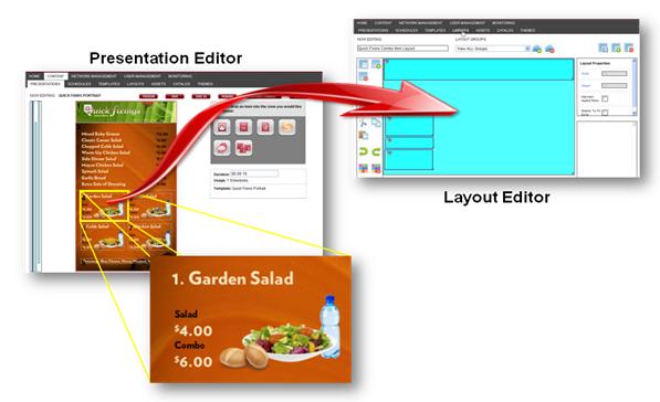
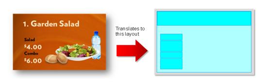
the price in another. See the Quick Fixings Example below.
To add layout item details:
1. Click the Add a new item detail
icon.
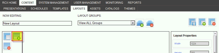
2. Size the zone by using one of the following
methods:
a. Drag a border
or the lower right corner (Point to the border with the cursor. When the
cursor is a double arrow, you can drag the border).
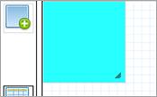
b. Use the Width
and Height fields in the Item Detail Properties to give the layout
exact dimensions.
NOTE: When you add the next item detail,
it may appear on top of another one, depending on where you put the existing
item details. Drag it to move. DO NOT
use the arrow keys!
TIP:
Use the copy/paste buttons located to the left of the layout if you have
layout item details with the same dimensions. Clicking the layout item
detail, then the Copy icon, and then Paste will provide an exact duplicate
on top of the other one. Simply drag it to another location or use the
properties. This is optional but really can be a time saver.


TIP:
Select the item detail you want to use and then click Snap to Grid
or Snap to neighboring item details.
Snap to Grid
turns on the ability to snap the created zone to the gridline. When you
draw, resize, or move a zone, it aligns or "snaps to" the closest
intersection of lines in the grid.
Snap to neighboring item details turns
on the ability to snap an item detail directly adjacent to a neighboring
item detail.
Show/hide wire frames toggles on and
off the blue filler in the item details. When wire frames are shown, the
item details become transparent.

Go
to Top of Page

Click
a layout item detail to edit the following properties:
Name: Name of the item detail.
Give the name of item detail a meaningful name, e.g., Title of
Meal. This is optional.
The
following fields are entered automatically, based on the current
placement and size of the zone. Edit them to change the menu item
placement and size.
Left: Left placement in pixels.
Top: Top placement in pixels.
Width: Width of the item detail
in pixels.
Height:
Height of the item detail in pixels.
Z-Index:
Indicates the stacking order of overlapping item details. An item
detail with a higher Z-Index will be in front of an item with
a lower Z-Index.
|
|
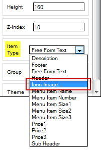
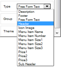
Item Type: Click
the drop-down arrow to see the list of fields to choose from. This choice
will determine which field of a Catalog Item is assigned to which layout
item detail in the layout. See Setting
Item Types.
(Layout)
Group: Select a group from the drop-down list of groups, if they have
been created—this group will be what we assign Catalog Items to when adding
a Layout to a Presentation with the Layout Widget.
See Using Layout Groups for more information.
Theme:
This is a read-only field that displays the theme
that has been applied to the layout item detail currently selected. If
no theme is applied and the layout is saved and closed, the system will
automatically apply a System Default theme. Once you apply
the correct theme, this field will display that theme after saving
and closing the layout.
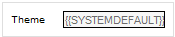 :
Automatically applied if no theme is applied by the user.
:
Automatically applied if no theme is applied by the user.
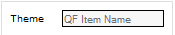 :
Displays applied theme when layout is opened again.
:
Displays applied theme when layout is opened again.
Go
to Top of Page
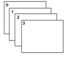
Understanding the Z-Index
The Z-Index in the Layout Editor allows for the layering
of layout item details enabling a more robust design. Layout item details
set at "10" will be the items closest to the front and the "1"
setting is the furthest back. Every number in between can be used if you
have several layers.
IMPORTANT: If your
template has a background image with zones in front that will contain
layouts, the background zone requires a layout as well with the background
image or .swf file placed in a catalog item. Otherwise, the background
image will cover the content in the layout.
If the background image is behind zones that contain
images, videos, and/or playlists that are not part of a layout, a layout
for the background zone is NOT required. The system recognizes the Z-Index
set in the Template Editor. See Creating
a New Template.
To create
a layout for a background image: (click to view)
Step
C. Assign Item Types
For
the system to know what piece of text or image goes into each layout item
detail when the board is assembled, an Item Type must be assigned. These
Item Types are then used when the catalog items (text and images) are
created so that there is a match.
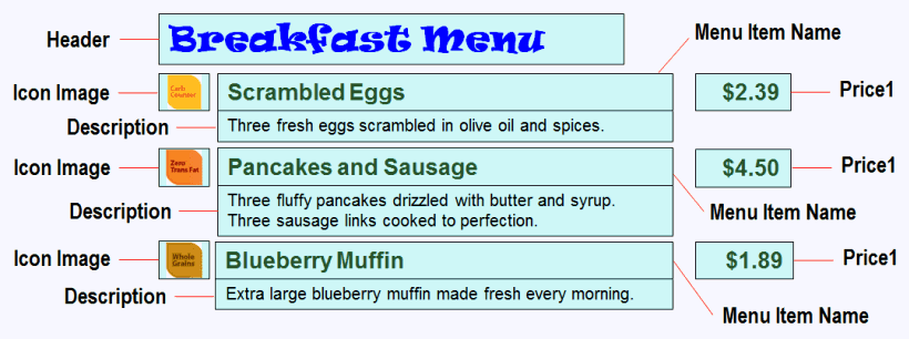
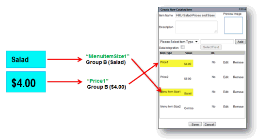
For
example, the header of an employee bulletin board would read: "Employee
Bulletin Board" and could be assigned the "Header" Item
Type from the Item Detail Properties and when the text is entered into
RoninCast, a catalog item named "<site prefix>-EmpBulBoard-Header"
would have the "Header" Item Type selected and the words "Employee
Bulletin Board" entered. The layout item detail Type matches the
catalog item Item Type.
All of the
Item Types are text-based except for "Icon Image" which is for
images only. In other words, every text-based Item Type can accept alpha/numeric
characters. The Item Type that makes the most sense in the context of
your board should be selected for consistency. Not every kind of text
you enter will have a logical Item Type, so select the closest one.
If the layout
contains several rows of layout item details, consider assigning the same
Item Type to each row. In this example, picture the text in each layout
item detail.
A layout group
would be created for each "set" of items, containing the icon
image, the menu item name, the price, and the description. One more layout
group would be created for the header alone. See Using
Layout Groups. A catalog item would be created for each layout group
and would contain all of the items in that group. Since four layout groups
will be created in this layout, four catalog items are created: The Header,
Row 1, Row 2, and Row 3. Each row would contain the icon image, the menu
item name, the price, and the description. See Determining
the Correct Item Type in Catalog Item Creation.
To
set an Item Type on a Layout Item Detail:
1. Click
the layout item detail once to select.
2. Under
Item Detail Properties, click
the Item drop-down list and select appropriate Item
Type.
3. Continue
setting an Item Type
for every layout item detail, including the background image if there
is one.
4. Click the
Save this layout icon  .
.
Step
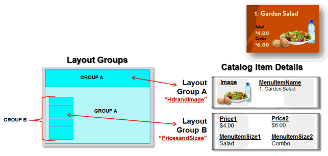
D. Create and Apply Layout Groups
Layout
Groups are the mechanism for populating (assembling) text, images, and
videos to the layout in their proper placement during the presentation
assembly process. Every layout item detail must belong to a group in order
to be used in the layout. A Layout Group must be created in the Layout
Editor before a Catalog Item can be assigned to it in the Layout Widget
Configuration during the presentation assembly process. There is a
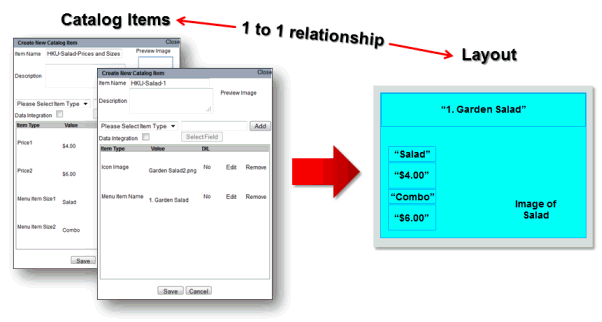
1 to 1 relationship between the Layout Group and the Catalog Item.

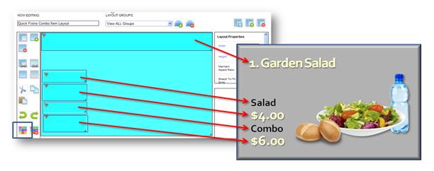
Quick Fixings Example
(click to open)
Practice!
The best way to learn how to create layout groups is to practice building
a simple layout, creating the group(s), creating the catalog items to
go with it, and then building a simple presentation to see if everything
works correctly.
Troubleshooting.
If some of your text items do not appear in the presentation, you will
need to look at the layout as well as the catalog items and see if there
is a mismatch of Item Types between the layout and the catalog item.
Five main steps in creating
and applying Layout Groups:
Identify the components of your layout.
Is there a header? A background
image? Do you have rows of text for say, menu items or hours of operation?
Is there an image within the layout besides the background image?
Is there a footer, sub-header, etc.?
Group the components in logical groups.
There is no right or wrong way
(except that you can't place two images within one group) but there
are some best practices. Each row in a menu containing a menu item
name, one or two prices, a description and/or nutritional information
would be one group. If there is a nutritional icon on each row then
that would be part of that group, as well. The header and background
image could be placed in another group. If there is a sub-header and
a footer, those also could be in this same group. If there is another
image then it could be in its own group.
Create layout groups and give them short and
descriptive names. Examples: "Hdrs
and Bkgd" -- Contains "Header, "Sub-Header," and
"Background Image." "Row 1" -- "Contains
items from first row of menu, e.g., nutritional icon, menu item name,
price1 and price 2, and description. "Row 2" would contain
the same as row 1. And so on with as many rows as is contained in
the menu or greeter board. An extra image that isn't the background
image could be just "Main Image" or something to differentiate
from background image.
TIP:
Creating a layout group for each row in a menu or hours of operation type
area is the best way of keeping the information organized and understanding
the order they appear.
TIP: Every layout item detail is automatically
assigned to the "Default Group." If there is only one image
and there are a few layout item details, you can leave them all assigned
to Default Group. Additional groups would be created if there is more
than one image and if there are rows of information that need the same
Item Type applied.
Assign the appropriate layout group to each
layout item detail. Each
layout item detail has to have a layout group assigned to it. For
example, in the first row of menu items, the "menu item name,"
"IconImage" (nutritional icon), "description,"
"price1," and "price2" would all be assigned the
group: "Row 1."
Test layout group assignments to verify they
are correct. There is a
simple way to verify the layout item groups have the correct layout
group assignment. At the top of the Layout Editor page, click the
"View ALL Groups" drop-down arrow.
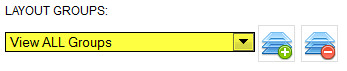
Select
each group in the drop-down list and verify that the correct layout item
details display. When selecting that group, only the layout item details
you want assigned to that group should display.
To create and use Layout
Groups:
1. Select the Layout Group icon.

2. Enter a brief Name of the group
in the Create New Group window.
TIP: Make them generic like: "Header,"
"Row 1," "Row 2," "Bkgd Image," etc. Make
them as short and distinctive as possible. Your site prefix is not needed.
3. Create a layout group for every “grouping”
of layout item details.
TIP: If there is only one group needed, leave
the layout group as "Default Group."
4. Select a layout item detail and apply the
appropriate layout group from the Layout Groups drop-down list
you just created.
IMPORTANT: Only one image can be
in a group, however, several text items can be in a group.
5. Continue
applying layout groups to each layout item detail in logical groups.
6. Click
Save this layout.

Go
to Top of Page
Step
E. Apply Themes to the Layout
Themes for the text are
applied in the Layout tab after the layout item details have been created
and grouped. While several layout item details (zone) can belong to one
Layout Group, themes are applied separately to each item detail.
Example:
(click to open)
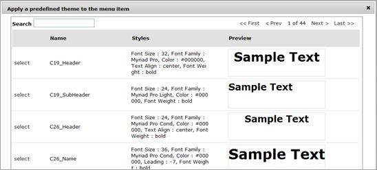
To apply a theme to a
layout item detail:
1. Select a layout item detail in the layout.
2. Click the Apply Theme icon in the
Layout Builder (Themes for the presentation were created earlier; see
Using Themes Management). The list of themes available in your
system appear.

NOTE:
If the themes for this board have not been created yet, save the layout
and then click on Themes tab to
create themes. When the layout is opened again to apply themes, the system
default theme will have automatically been applied to each layout item
detail. To override the default theme, use this same process starting
in Step 1.
3. Click the Select link for the theme
you want to apply.
4. Continue until all layout item details
(except for those with "Icon Image" Item Type) have had a theme
applied.
NOTE: Layout item details designated for images
do not need a theme applied but will have a system default them applied
automatically.
5. Click Save this layout. 
Go to Top of Page
Editing Applied
Themes
The theme that has previously
been applied to a layout item detail (or if the system applied the default
theme) can be changed to another theme. When Save this layout is clicked,
all presentations using this layout will display the new theme(s).
However, there is an exception.
If a user has changed the theme on a presentation-level using the Change
Theme button in the Layout Widget Configuration, that theme cannot be
overridden from the layout in that particular presentation. If that user
clicks the Remove Theme button, it can updated from the layout again.
See Overriding the Theme for
more information.
Removing Applied
Themes
Once
you have applied a theme to a layout item detail, it can be removed, however,
it is then automatically replaced with the system default theme.
1. In
your layout, click the layout item detail once.
2. Click
the Remove Theme icon.

3. Click
the Save this layout icon.

IMPORTANT: Each
layout item detail has to have a theme applied to it. A user-defined theme
that is removed using the Remove Theme icon will be replaced with the
system default theme.
Go to Top of Page
Saving
the Layout
When
you save the new layout, it is added to the list of layouts in the Layout
Management window. It will also be shown in the list of layouts in the
Layout Widget Configuration window.
1. Click the Save
this layout icon.
The
following dialog appears:
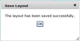
2. Click OK
to close the dialog box.
Go to Top of Page
Using the Layout
The saved layout will be
available to choose in the list of Layouts in the Layout Widget Configuration
window when assembling the presentation. The layout is added to the presentation
by dragging the Layout Widget to a zone (see
Adding a Custom Layout using the Layout Widget Control).
After the layout is selected
in the Layout Widget Configuration window, catalog items containing images
and text are selected using the Layout Groups created in the layout. These
Layout Groups are selected in a drop-down list in the Layout Widget Configuration
window.
Editing an Existing Layout
The changes you make to
the layout will be made to all templates and Presentations that use the
layout.
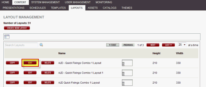
Click
Edit
for the layout you want to change.
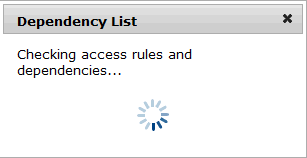
The system processes the
access rules and dependencies.
It checks if your access
settings include viewing, updating, or deleting the selected layout. If
you are not permitted to open this layout, a message will appear stating
such and the layout will not open.
It also checks where this
layout is currently being used. If it is being used a Dependency List
appears with the Players, Schedules, and Presentations tabs if the presentation
has been scheduled and assigned to a player.
All presentations listed
in the Presentations tab of the Dependency List have a Preview button
which opens a preview of the presentation without leaving the page.
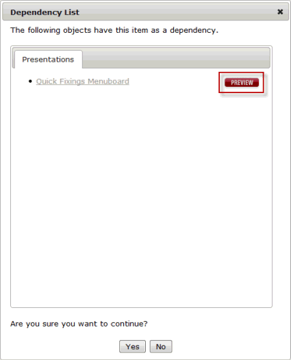
Each tab will list all
of the items that would be affected if the layout was edited in any way.
If you are sure that this
layout can be viewed and/or edited, click Yes and the following window
appears:
See Creating
a New Layout for more information about changing the item details
in the layout.
Go
to Top of Page
Saving a Layout as a Different File Name
To copy a layout and give
it a different name:
1. In
the layout editor, select the Save layout as icon.
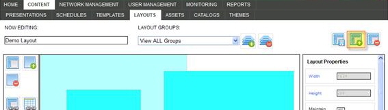
The
following dialog appears:
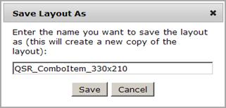
2. The
Save As name defaults to the current name with an incremental number
after it. You can change this name.
3. Click
Save to save the new layout.
Go
to Top of Page
Deleting a Layout
NOTE:
When you delete a layout, only the layout is deleted. Templates and Presentations
that use the layout are not affected. Any presentation zone containing
content with that layout will become empty.
If you do not have the permission to delete layouts, the Delete button
will be grayed out.
Click the Delete
button for the layout you want to delete. A confirmation message appears
to verify that you want to delete it. You can delete a layout from either
of the following:
The Layout Management Window
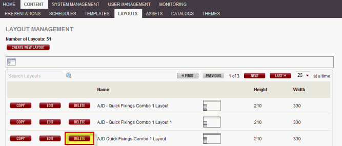
The Layout Editor
Go
to Top of Page
Copying a Layout
If you have created a layout
which contains the same or similar specifications as a new project, you
can save time by copying and renaming it rather than creating a new layout.
1. In
the Layout Management window, select the Copy link for the layout
you want to copy.
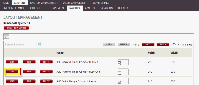
The following window appears:
2. Select a folder in which to place the new
layout.
The
following dialog appears:
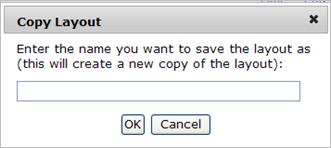
3. Enter a name for the copy.
4. Click OK
to create the copy.
Go
to Top of Page